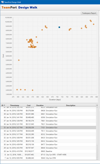
On the left, Teamport DesignWalk illustrates simulation cost and duration results as points on a cartesian grid, a "tradespace" graph.
The graph (top-left) shows the forecast results of models of this project that have been simulated. The left-side bottom table lists these forecasts and can be manipulated (see below). Selecting a row in the table will highlight the point on the chart to which it corresponds, which will display as a blue square instead of a red dot.
Each dot on the graph is an average (mean) result. Double clicking on the forecast in the table below will show in the chart a spread of monte carlo forecasts for that model (if the simulation included Monte Carlo).
The table can be sorted by any column. Select a column to sort on it and select a second time to reverse the sorting direction. The columns can also be reorganized by dragging them to different locations in the table header.
When reviewing the tradespace, differences in forecasted outcomes may be driven by changes in a model, differences in the simulation method, or both. For example, the very same model, with no changes, yet simulated twice -- once using a classic critical path equivalent and again using GPD's method -- may yield very different forecasted project outcomes.